

Hello Everyone,
This past month has been quite a busy one, not just within the Sports Industry, but for myself too. Which left me unable to put my spin on some of the countless stories hovering around the Sports World, both at the Collegiate Level and Professional. So hopefully this is the beginning of more consistent posting, hopefully a future podcast…
There have been numerous brand tweaks (Rutgers, Virginia Tech, Florida Panthers), new apparel partnerships (Cal and Under Armour), uniform updates (Purdue, Central Florida, Oklahoma State and Oregon) and even a complete brand overhaul (Sacramento Kings). Which got me thinking that with so many changes occurring in the industry, I wanted to look back at some of the other recent rebrands of the past couple years. Many of these rebrands seem to be going back to a look of the past, just take a look at the Pittsburgh Penguins and the rumors that they are going back to their “Pittsburgh Gold” primary color.
It made me think about other franchises and universities that previous had wonderful brands, in my opinion of course but went away from them for one reason or another. With the Kings and Penguins returning to a “retro” look, I want to share my thoughts on five Franchises that should look to the past when determining their brand for the future –
- Philadelphia Eagles – A Return to Kelly Green
I remember back in the days of the original Nintendo system that I had as a kid, where playing Tecmo Super Bowl was one of my favorite things to do during after school. One of my favorite teams to use was the Philadelphia Eagles and their speedy QB Randall Cunningham. Their bright, 8-bit Kelly Green jerseys popped out from the screen and began its influence into what is now my favorite color. So, when they brought out the old-school Kelly Green jerseys for their home opener in 2010, I was very intrigued and excited to see them again.

Now ever since that game, fans have been starting numerous petitions for the team to bring back the uniform and color scheme on a permanent basis. Especially when compared to the alternate black jerseys they have that don’t seem to match their current “pine green” color.
Bring back the KELLY!
- Orlando Magic – The Shaq-era Pinstripe Era
Last month, I watched the ESPN 30 for 30 documentary “This Magic Moment” which focused on the birth of the Orlando Magic in the NBA and how they were able to quickly become an Eastern Conference Contender. They even made the NBA Finals in ‘94-’95, just their sixth year of existence! But one thing that was really noticeable were the jerseys they wore during this era.
Pinstripes were very popular during this period, with everyone from the Bulls, Rockets, Raptors and Pacers wearing them. The Magic was no exception, but what stood out for them was its color scheme. While not really a Royal Blue, their Blue pinstriped road uniform looked absolutely gorgeous, especially when they played the Bulls and their Red and White counter uniforms.


Add to that their “Orlando” wordmark, with the star in place of the “a” and you have an amazing jersey. They have brought it back every now and again for a Throwback night, but I could really get used to seeing those jerseys back on the court on a permanent basis.

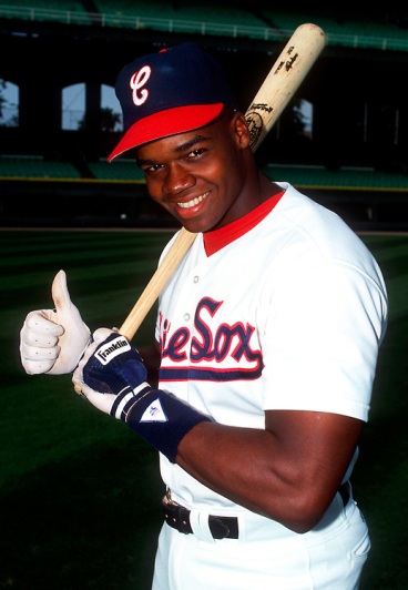
- Chicago White Sox – The Batter
All of you know that I am a diehard Chicago Cubs fan, but even I have to admit that the team on the South Side does have an impressive brand and color scheme. To me though, nothing beats their “Batter” era from 1976 – 1990… Now hear me out.
The MLB-Logo like batter on the primary logo and caps, the Red, White and Navy Blue color scheme, the multi-tone hats, both sets of wordmarks (SOX and cursive Chicago)… The “Winning Ugly” uniforms are not ugly to me in the slightest!


I am very happy to see the White Sox embracing this part of their brand’s history, incorporating these uniforms into special theme nights. They have even brought back the Batter logo to their current Spring Training/Batting Practice uniforms, converting it into their current black and white color scheme. Heck, this is a hat I am even thinking about buying because of its impressive look.

Now, if only they can reincorporate the cursive “C” from their late 80’s uniforms…
- Los Angeles Clippers – Old Logo and Scheme
This one is pretty self-explanatory…
I understand the reason for the Clippers rebranding themselves a year ago. A new owner, the fallout from the Donald Sterling controversy and the fact that the Clippers haven’t won an NBA title, i.e. no notable history with the brand are definitely reasons to form a new look and feel for the franchise.
However, this rebrand just doesn’t make sense to me. Some of the directions the team went were a little off. The “NBA Live” primary logo, adding black to the color scheme, the names placed below the numbers on the back of the jerseys, etc.… The new LAC logo shows some nice promise, but that’s about the only thing positive I can say about this branding.

I miss the cursive wordmarks, the secondary logo of a ship… Couldn’t we at least get the baby blue to replace black in the color scheme???

- 1(Tie). Pittsburgh Penguins – 90’s Penguin and Buffalo Sabres – Red and Black Buffalo Head
There is no doubt I am going to be in the minority here, but when I was growing up in the 90s, these brands took my eye from the very beginning!
The primary Penguin logo is an amazingly realistic for its time, along with the “Pittsburgh” Gold and Black color scheme, looked awesome when Jaromir Jagr was flying down the ice. (Pun Intended)
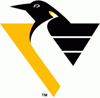
I also am a huge fan of the diagonal “Pittsburgh” wordmark that they featured on their black road jerseys, a look very similar to the classic New York Rangers’ uniforms. I think they are right behind the Blackhawks for the best uniform in the league, which would explain why I am so fond of this uniform.

Then we have the Sabres’ uniforms from the Dominik Hasek era, who while growing up was my favorite players. The intimidating Buffalo head is just one of the many reasons that Hasek intimidated opponents.

The red and black color scheme has always had the “cool” factor, but their road white jerseys with the black and silver accents are very impressive. The Raiders are known as an intimidating team thanks to this scheme and coming off a time where the Sabres needed an image change after some pretty terrible years, they probably looked to Oakland.

To me, everything about this uniform is unique, from “sword-stabbing” alternate logo to the one-of-a-kind typeface… It just holds a special place with me.
So how bad do you want to yell and scream at me based on this list? Let me know!
