
Volume Two for the year is going to feature the upcoming “Big Game” next week, apparel companies looking to secure their place in the soccer market and the latest bright (literally) and shiny thing from Nike.
Across the Pond
- The big thing that got my attention this week had more to do with a dollar amount versus a new branding deal. 1.4 Billion Dollars to be exact actually! The major rumor going around is that one of the greatest soccer franchises and recognized soccer brands, Real Madrid, appears to have re-upped their apparel deal with adidas for $1.4 Billion.
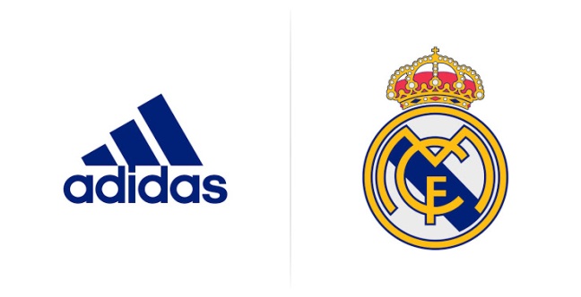
- While the deal is yet to be confirmed by adidas, the deal is believed to give Real $140 Million a year through 2026. This new deal would be the first time a team will receive over $100 Million Dollars a year from an apparel supplier.
- adidas has clearly made soccer a focal point for their business, given that after this near deal is finalized, it will give the company six out of the top ten most valuable kit/apparel deals in club football. Securing Real Madrid for the next ten years, with the acquisition of Manchester United this season, confirms that adidas will have the top brand names in Spain, England, Germany and Italy through 2021 at the earliest.
- In addition, Under Armour is looking to make a further dent in the soccer landscape, including in the English Premier League. After making an initial impact with a long-term deal with Tottenham Hotspur, Kevin Plank’s is looking to slowly but surely increase their notoriety across the pond after agreeing with current Premier Leaguers Southampton and Aston Villa.
- These new deals will give UA a consistent presence with a league that is increasing in popularity on a weekly basis; thanks to the coverage NBC Sports has given the league. Southampton has become a solid, top-half team in the League and Tottenham is contending for a potential Champions League spot…
- Lastly, now we begin the period where all MLS Teams are beginning to reveal their kits for the upcoming season. Portland, New York, LA Galaxy, San Jose and Chicago have already revealed one of their looks already, getting me very interested in the upcoming season in a month. More on the debut of the new kits during my next blog post, including one where adidas let a big mistake fall through the cracks!
Lite Brite
- On Saturday the 23rd, Michigan State took on Maryland in a battle of the top contenders in the Big Ten. This was a significant battle that received a lot of attention and promotion from ESPN and their College Gameday program, even as the Spartans went on a two-game losing streak before this.
- The Swoosh took notice of how important this game was as well, to ensure that they were in the news just as much as the Saturday Night game itself. For the couple days prior to Saturday Night, Nike began to heavily promote the “Mean Green” uniforms they were debuting our of their Hyper Elite Disruption uniforms for the game.
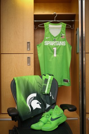
- Nike has been known for incorporate bright and flamboyant colors into their college uniforms, see Oregon specifically (and my last blog post)! They have done it before for Michigan State… But nothing as noticeable as this combination of lime green and a parking coordinator’s vest.
- On the TV Screen that night, the green itself didn’t look that bad. But the issue I took with it was the Spartans’ shorts. The shorts featured a gradient look from the Spartan Green at the bottom, transitioning to the bright, lime green that is featured on the majority of the uniform. I hated the transition myself!
- My thoughts are if you are going to do a different color/look, go all the way! MSU should’ve gone the full lime green route for the entire uniform because the single colored top looks just fine.
- In addition, as one of my friends said when watching this game, why would a school go so far away from its actual school colors? Which begs the question, does Nike have more Disruption uniforms coming down the line? Duke, Kentucky, Oklahoma, LSU (Ben Simmons) are all possibilities in my opinion!
Super Bowl
- Full disclaimer, this portion of the post is not going to be featuring anything about the game itself, nor the advertisements that played during the game.
- This post is actually going to be about the Broncos’ decision to wear their white (road) uniforms for the game, while being designated as the home team. This was a strange proclamation because as most of you know, the home team switches from NFC to AFC every year, i.e. Even Numbered Super Bowls – AFC; Odd Numbered Super Bowls – NFC.
- Now, most people would assume that this choice is simply because during the team’s last Super Bowl, XLVIII while wearing orange, they were throttled by the Seahawks 43-8.
- But there actually is a lot more background for this reason, which Paul Lukas of ESPN goes a little more in depth about why this could (and did) be a good idea for Denver. The fun facts include:
- The last Super Bowl the Broncos won was wearing their white uniforms, Super Bowl XXXIII in 1999.
- Due to their branding change from a couple years ago, their navy blue jersey was reduced to alternate jersey status. This is the only other jersey that the Broncos have won a Super Bowl, XXXII in 1998.
- With orange being their primary home color, a jersey they are 0-4 in Super Bowls while wearing, you can see why the Broncos were hesitant to put them on again.
- This isn’t even just a Denver thing, according to Lukas’s statistics –
- Teams wearing white jerseys had won 10 of the past 11 Super Bowls.
- The previous four teams who have decided to white as the Super Bowl “home team”, went a collective 3-1 in their games.
- Peyton Manning’s only Super Bowl win came while wearing white, Super Bowl XLI in 2008.
- I do wonder what they would have chosen if navy blue was still their primary home color, the jersey that John Elway famously won his first Super Bowl with…
A Bit of a Throwback
- Some of my personal favorite “stories of the day” has to be when I see a sports team look to their past for brand ideas for their future. Their throwback looks, whether temporary or permanent, are fascinating to me when I read about the reason behind their move.
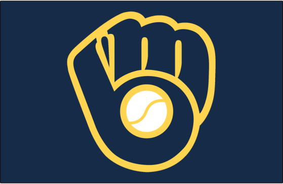
- The Milwaukee Brewers caught my eye this week with the introduction of their new alternate jersey, which incorporated their modern colors with a look from their past.
- One of the franchise’s most popular hats, in fact one of the most popular in the league, is the ball-and-glove logo that championed the Brewers brand in the 80s. This logo is being brought back on an “almost” permanent race, as it is now the featured logo on their new alternate jersey kit.
- Combining the brand’s current colors of navy and gold, along with the Milwaukee script featured on the front of the jersey, the ball and mitt makes their modern debut, apart from their usual Retro Friday games where they where the full uniforms the team had in the 80s.
- In my opinion, this is a great way from the brand to appeal to their fanbase, who love the retro look of the logo. However, it still contains their current brand standards and their modern look and feel. It appeases the fans that wish to go back to the “good ‘ol days”, while avoiding the hassle that comes from a complete brand revamp.
- My second throwback story involves one of the more obscure jerseys in my opinion, the Vancouver Canucks jersey of the 80s and early 90s featuring a skate in bright red, yellow and black colors.
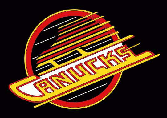
- Full disclosure, I don’t know what a Canuck is. I know it is a derogatory term for Canadians, but I still don’t understand how it ended up being the nickname for Vancouver’s NHL franchise. Even now, I don’t see how the current whale branding refers to a Canuck versus Vancouver itself.
- Then again, how does a skate that looks like it is so fast that you can see light? At least that is my interpretation of it this look, which lasted for about two decades before being replaced by the current whale branding in 1996.
- In fact, this uniform is a part of Vancouver’s “20 in 20” promotion, celebrating that the Canucks have spent 20 years in their Rogers Arena home. Which coincidentally (probably not) matched up with the team’s rebranding.
- This will be the first time the black, red and yellow skate will be featured in the Rogers Arena, which will no doubt bring some positive nostalgia to the Vancouver fans will see the brand that brought two Stanley Cup Final appearances (’82 and ’94) versus only one for the current look and feel (‘11).
Join me next time where I will be talking about a lot of news that began in February, including the Super Bowl commercials, the new Maple Leafs brand, MLS Kit debuts (and mistakes) and Kentucky’s new Wildcat! Perhaps there will even be a new format for my posts. Hmmm……
