What a very interesting start to the new year, especially in the Sports Marketing field!
As I hope to begin blogging on a more consistent basis, I thought something I can start with would be a weekly recap of some of the advertising stories that I was very interested in. I’ll obviously still be writing more in-depth posts in-between, but why not get started with something a bit easier for other visitors to read.
So here we go… here are my favorite stories of this past week:
- Across the Pond
– A very interesting read came out of the UK last week that will affect the biggest sport in their country, as well as my Saturday mornings. It was already announced that Barclays would not be renewing their sponsorship of the English Premier League after this season and the EPL would not be looking for a replacement sponsor.
– Because of this loss of sponsorship, the Premier League will rename itself as the “English Football League” and will rebrand the league’s identity. As of last week, the league has not reached out to any agencies to assist in the rebrand. However, they have said that the agencies will be instructed to remove the Lion that has been featured in the logo since its inception in 1992.
– With the MLS rebranding its league look this past year and many more soccer franchises across the world doing the same thing, I am very interested to see what the brand new “EFL” brand will look like on the sleeves of the team uniforms in ’16-’17.
![]()

– In addition to the EPL rebranding, league juggernaut Manchester City is going back to its roots for a rebrand that the team’s supporters have been calling for since their current logo debuted in 1997. At the time Manchester City was going through a heavy decline, dropping all the way to the third tier of England’s soccer leagues! The team needed a refresh in order to draw their fans into the stadium (and a logo that could claim as a trademark) and support the squad, which is why the fierce eagle was introduced.
– Now that Manchester City has been firmly re-established as a dominant player in the Premier League, and in Europe, fans wanted the removal of the eagle that had been criticized for not being a part of the City of Manchester’s history. In fact, for every major cup final the team has played since the eagle’s introduction with a badge that bears the badge of arms for the City of Manchester!
– So, for a summer of 2016 introduction, the team debuted an updated version of the team’s previous crest, complete with a more detailed version of the ship and rose that became synonymous with the club in their early Premier League days. Modern updates to logos/crests of the past has become a very popular trend for sports franchises, so it does not surprise me that City has come up with this decision. I approve of this logo update, but hopefully they won’t be updating their baby blue home kits in ’16.

- Deadpool… Such a smartass 😉
– I have become fascinated with the campaigns that blockbuster movies utilize, from the debut teaser trailers to the final movie poster and social media posts the day before the premiere date. None has been more interesting in the last couple of months than Deadpool, the latest Marvel superhero movie from 20th Century Fox (well, maybe Star Wars… stay tuned). 20th Century Fox needs a successful superhero flick after their 2015 tentpole, Fantastic Four, was one of the a major flops of the year. So naturally, the studio is putting all of its focus on Deadpool to start 2016.
– However, Deadpool is not exactly the most marketable superhero to the public. Let’s face it, most Deadpool fans are Men ages 15-35… That is about it! But the character of Wade Wilson is an arrogant, fourth-wall breaking smartass who would try to sell this movie in any way possible.

– 20th Century Fox has seemed to embrace that, based on the ads that were featured last week… Hey guys, want a way to convince your significant other to see this movie over Valentine’s Day Weekend? Show her this minute-long trailer and accompanying billboard. What better way to show your girlfriend a romantic V-Day weekend then by a romantic movie staring Ryan Reynolds as a guy fighting for his life with the woman he loves… 😉

– The second is a billboard that is featured across Los Angeles that tries to reach the millennials who are obsessed with using emojis in their messages. In this day-in-age, I guarantee you Deadpool would find it very amusing to call himself “skull face, poo smile, L”.

- Toronto Maple Leafs Brand “Refining”
– Sportslogos.net is one of my favorite websites and I visit it multiple times during the week. Chris Creamer is a uniform news/critic out of Canada, so some of his best stories refer to possible uniform updates for Canada’s professional franchises. He was able to break the story of the Toronto Raptors rebrand that went into effect this season. Now it seems that he has done it again.
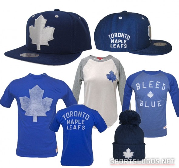
– A month ago, Creamer announced that the Toronto Maple Leafs would be getting a new logo for the ’16 – ’17 season, with little hints of the new branding being “leaked” in the last month. Some of the “potential” aspects that have leaked so far includes a solid blue/white maple leaf and the team being called “Toronto Maple Leaf Hockey Club”.
– Last week, the “club” announced a new line of hats and apparel that features the solid leaf and the old Toronto Maple Leafs wordmark and script. Not only that, but quite a bit of the apparel features a solid silver leaf, which has me wondering whether this new brand will introduce a new color into the club’s color pallet. I believe a silver/gray jersey featuring a blue leaf or blue team wordmark could be a very interesting addition to the team’s history.
– Now is the time to do it for this team! They are currently in the largest Stanley Cup drought of any Original Six franchise in the National Hockey League and are beginning a new era under coach Mike Babcock. This struggling franchise needs something to bring up their spirits and draw their rabid fan base back to the arena. What better way than an update to a brand that has not won a Stanley Cup since the primary leaf was updated to reflect the Canadian flag’s leaf!
- NFL in Los Angeles – One or Two?
– So, now we know that next season, the NFL will have a franchise in Los Angeles as the St. Louis Rams officially moved to the city last week. Now already rebranded as the Los Angeles Rams, the team will spend the next three years at the LA Coliseum while their new $1.8 Billion stadium is built in Inglewood. The San Diego Chargers have an option to join them as a tenant in their new stadium and have until January 2017 to decide whether to go. We have yet to hear whether they will move forward with that move.
– In the meantime, one of the common questions presented to Ram executives in the past week was whether the Rams would be returning to their old color scheme with the move back to LA. As you notice in the following tweet screenshot, the Rams are telling reporters that there are plans in place to update the Rams uniforms for the 2019 season. This is the season the Rams will be debuting in their new Inglewood stadium, so it makes sense for this significant point in the franchise’s history for the Rams new look to debut.

– The question is whether the original colors of gold and navy blue will be returning to the field in this rebrand? Kevin Demoff, the Rams Executive VP of Football Operations has made it known that the prior colors are being considered. The cries for gold and navy blue had grown over the past couple years in St. Louis during the couple games the Rams were break out those colors and it seems that LA fans were wanting a return as well. However, these weren’t the only old colors that the Rams have used in the past, leaving Demoff’s comments a bit open to interpretation.
– Before gold was a primary color, white was featured in its place as the color of the jerseys and the ram horns on the team’s helmets from 1965 – 1972. In fact, in 1949 their primary color on the helmet was red, paired with the yellow ram horns. This was removed after just the single season, but I tend to believe that this was done to take advantage of USC’s popularity at the time.
– Please refer to the Paul Lukas article on ESPN for a more in-depth analysis of their uniform history.
– So by the looks of it, the Rams will not be changing aesthetically for their upcoming seasons in the Coliseum. I look forward to reading more about the re-debut of the LA Rams brand, whose script and wordmark logos have already been updated with their new home.

- More Soccer for Los Angeles
– So, why is there a story higher on my list then an NFL franchise moving to a new home? Because LA debuted another new sports franchise last week that peaked my interest.

– The Los Angeles Football Club, rising from the ashes of the failed Chivas USA MLS franchise, debuted its new badge, colors and apparel that will begin its games in 2018. Gold and Black, two strong, impressive colors that compose the LAFC brand, begins the marketing campaign for a franchise that needs to make its mark in a city that seems to be growing every day in sports competition.

– The celebrity-laden ownership group grew even more on the announcement day with the addition of Will Ferrell as a part-owner, bringing in another noteworthy name to compete in the ever-growing LA sports landscape (see point two).
– The notes from crest designer Matthew Wolff state that the logo concept started with a simple drawing at a bus stop, which evolved into the current iteration. He explains that everything about the new branding, from the crest’s shape, color palette and unique typeface, tie back to city of LA.

– When compared to the Los Angeles Galaxy, anyone associated with LAFC focused on making this franchise the city’s soccer team, versus the surrounding suburbs. Wolff states on his website that “the shape of the shield is derived from the Seal of the City of Los Angeles. The black and gold color scheme reflects the success, urban texture and glamour of Los Angeles.
– Wolff continues, “The wordmark is set in Neutraface, a nod to downtown Los Angeles’ rich collection of Art Deco buildings dating back to city expansion in the 1920s. At the heart of the crest is a wing, paying homage to the City of Angels and the city’s Aztec and Mexican heritage.”

– Now that the team’s identity is out into the market, LAFC now have a couple years to build a following in LA market. Their new stadium, which will be built and ready for the 2018 season opener, will be right next to the LA Coliseum in the heart of the city. With this prominent location secured, the next step will be for the team to make a big splash whether through their manager or first big player signing.
– The latest franchises in the MLS, Orlando City SC and New York City FC, were able to sign European stars Kaka, Frank Lampard and David Villa to name a few. With the rival Galaxy signing Steven Gerrard, the bright lights of LA will be a big draw for some stars, if the owners are willing to shell out the money to make an impact to compete for interest.
– I believe LAFC will need a prominent player signing before their team debut in order to make even a small impact in the LA market. A market that could at that point include two NFL, two NBA, two MLB, a rival MLS and champion NHL franchises to compete for fans and attendees. Hopefully, this new team can follow the growth of the MLS in this country and make a significant mark in the City of Angels.
What do you think? And this is only in the first two weeks of the year! One can only imagine what is to come, especially if we get a second NFL franchise in Los Angeles. We shall see…